My Movie Poster
My poster was inspired by an indie-film poster I found that had hand graphics all over it. This film, Jenseits der Stille, or Beyond Silence, is a German film about a girl born to deaf parents and her passion for music. I chose to incorporate American Sign Language into the poster by spelling out out the title. The top two signs represent beyond, and the other 5 represent silence, or quiet.
Wednesday, May 1, 2013
22 March 2013
Citizen Kane
The above scene is very descriptive in and of itself. For someone who has not seen the movie, this image is about to tell the story fairly easily on its own. The man at the left is clearly upset about the woman signing the paper the nicely dressed man has brought. The boy in the window seems to imply that that argument is about him, and that he is totally unaware of what is happening. The composition of this shot is incredibly well done and helps the viewer truly understand what is going on in the scene without even realizing it.
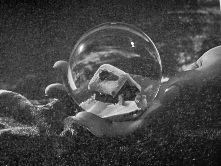
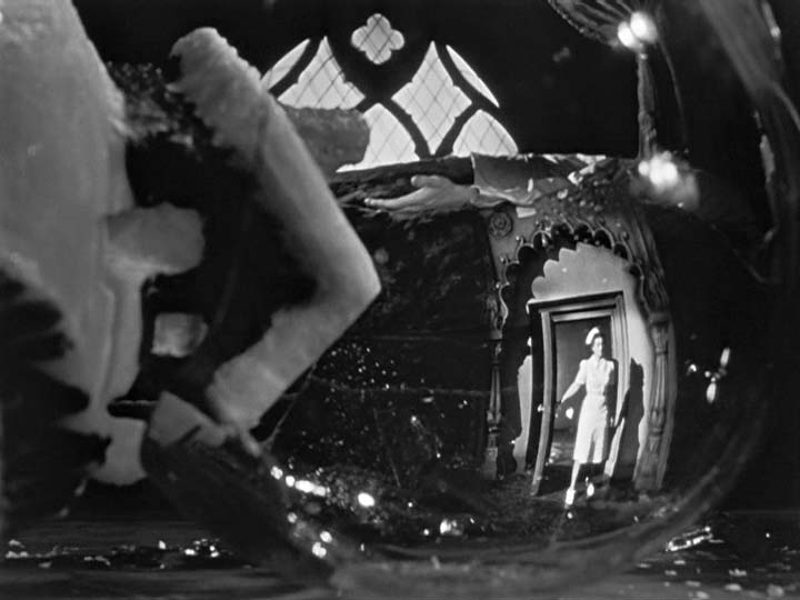
The above scenes are my favorite shots in the film. I have always loved when a camera focuses on the reflection of something to show the audience what is happening. I think this creates an almost double-meaning of what is real and what the characters are hiding inside themselves. The broken glass is also very symbolic of the total ending of something, or being totally broken down.
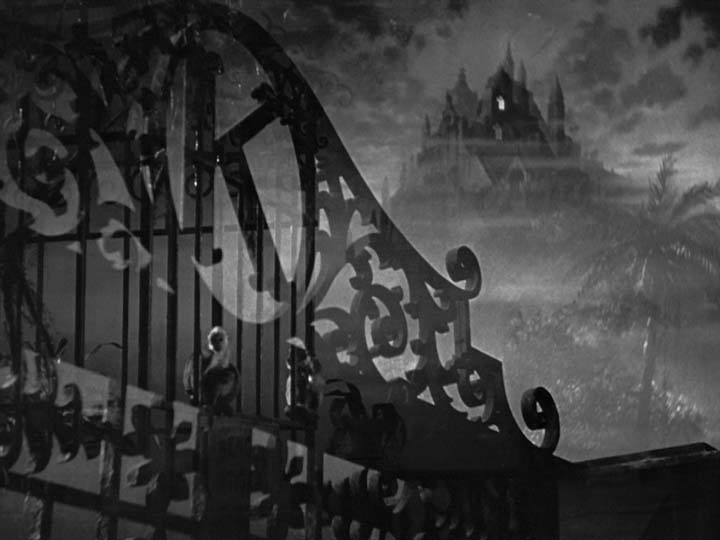
The above scenes are part of the opening of the film. The mansion in the background is very subtle, but incredibly effective. It is faded in the background, allowing it to be just barely present, and as the scene plays, the camera never seems to get closer to it, almost as if can never be reached. The mansion because this looming, intangible place, setting a very important mood for the film.
19 April 2013
My Costume Design
I have always loved fantasy books and movie that involve elves and rangers and things of that nature. I also love the Medieval and Renaissance time periods. I was inspired partly by the Harlequin patterns and colors of jesters as well as the classic wood-elf outfit to create my costume.
Friday, April 5, 2013
5 April 2013
Sonia Delaunay - Rythme Coloré
The above pattern is very unique in that it tricks the viewer into thinking it is about one thing, but then sort of says something different. What I mean by this is that on first glance, the viewer sees various circles inside one another, as if Delaunay drew several circles on a canvas and then filled them in with paint. After a closer look, however, it becomes apparent that the circles are not filled with color so much as the colors make up the circles. The painting would be incredibly different if it was only in black and while. The colors add a new abstractness to the circles than the use of line would alone.
William Morris - Tulip and Willow
I have always loved Medieval-style art and the intricate details of it. Many of Morris's pieces are inspired by this Medieval craft style. He was even part of the Medieval Crafts Guilds, a group of artists, architects, and craftsmen who were dedicated to maintaining a high level of quality among their works. This piece is no exception. I love the way he tediously overlaid the leaves with each other, and added depth with the different hues of blue. The leaves, which are those of a willow tree (which also happens to be one of my favorite kinds of trees) are very reminiscent of leaves and vines used in Medieval lettering. I like that this can be turned into a recurring pattern as well due to the subtle repetition in gray behind the blue leaves.
Marimekko - The Kalevala
This Marimekko fabric was inspired by the Kalevala, the Epic Finnish national poem. The poems were a contributing factor to the puh for Finland's independence from Russia. This particular pattern features the animals from the poems which were enchanted by a kantele, which is a string instrument similar to a zither. The poems in the Kalevala feature mythological situations and emit a storybook quality, which is something I have always had a passion for. In addition, they remind me almost of spirits, like in movies like Pocahontas and Brother Bear. I have always had a love of Native American culture and Egyptian hieroglyphics, which were clear stylistic inspirations for this piece.
Persian Patterns - Rugs
Growing up, my family has always had a lot of European and Asian pieces due to the amount of traveling my Grandfather and Father did through the military. I have always grown up with intricately patterned rugs, which always struck me as incredibly beautiful. The above rug is one of the nicest patterns I found which also reminds me of the rugs I grew up with. While I love patterns that can be repeatedly perfectly, I also love the kaleidoscope look of images that are horizontally and vertically flipped, then placed next to each other to create a clear repetition. The colors used in the above rug and it's finely detailed, curling lines truly illustrate this kaleidoscope look. The stripes on either side of the rug, which act as a border similar to borders found on the pages of Medieval books, seem to be a signature aspect of these Persian patterns, particularly rugs.
Japanese Patterns - Umbrellas
Japanese culture has several signature items and designs which are easily identified as Japanese. One of these such staples is the traditional Japanese umbrella. In American society, umbrellas have typically been used for the beach and rainy days. In Japanese culture, they are instead used to block the sun, or simply as a fashion accessory with traditional Japanese attire. They are typically made of wood and a perhaps a less water-resistance fabric than traditional American's one, which they then paint on and create intricate designs. This pattern exemplifies their unique shapes and lightweight design. The way all of them sort of lay on top of each other, or seemingly float through the sky, gives the impression of them being lighter than air. This particular pattern also utilizes the negative space in the image by using the white at the lines for the umbrellas instead of the blue.
My Own Pattern Design
I also created my own pattern. I really liked the Marimekko designs we looked at and had started this design several months ago, but had never though of making it into a pattern. I used the Marimekko patterns as inspiration to complete this one.
The above pattern is very unique in that it tricks the viewer into thinking it is about one thing, but then sort of says something different. What I mean by this is that on first glance, the viewer sees various circles inside one another, as if Delaunay drew several circles on a canvas and then filled them in with paint. After a closer look, however, it becomes apparent that the circles are not filled with color so much as the colors make up the circles. The painting would be incredibly different if it was only in black and while. The colors add a new abstractness to the circles than the use of line would alone.
William Morris - Tulip and Willow
I have always loved Medieval-style art and the intricate details of it. Many of Morris's pieces are inspired by this Medieval craft style. He was even part of the Medieval Crafts Guilds, a group of artists, architects, and craftsmen who were dedicated to maintaining a high level of quality among their works. This piece is no exception. I love the way he tediously overlaid the leaves with each other, and added depth with the different hues of blue. The leaves, which are those of a willow tree (which also happens to be one of my favorite kinds of trees) are very reminiscent of leaves and vines used in Medieval lettering. I like that this can be turned into a recurring pattern as well due to the subtle repetition in gray behind the blue leaves.
Marimekko - The Kalevala

This Marimekko fabric was inspired by the Kalevala, the Epic Finnish national poem. The poems were a contributing factor to the puh for Finland's independence from Russia. This particular pattern features the animals from the poems which were enchanted by a kantele, which is a string instrument similar to a zither. The poems in the Kalevala feature mythological situations and emit a storybook quality, which is something I have always had a passion for. In addition, they remind me almost of spirits, like in movies like Pocahontas and Brother Bear. I have always had a love of Native American culture and Egyptian hieroglyphics, which were clear stylistic inspirations for this piece.
Persian Patterns - Rugs
Growing up, my family has always had a lot of European and Asian pieces due to the amount of traveling my Grandfather and Father did through the military. I have always grown up with intricately patterned rugs, which always struck me as incredibly beautiful. The above rug is one of the nicest patterns I found which also reminds me of the rugs I grew up with. While I love patterns that can be repeatedly perfectly, I also love the kaleidoscope look of images that are horizontally and vertically flipped, then placed next to each other to create a clear repetition. The colors used in the above rug and it's finely detailed, curling lines truly illustrate this kaleidoscope look. The stripes on either side of the rug, which act as a border similar to borders found on the pages of Medieval books, seem to be a signature aspect of these Persian patterns, particularly rugs.
Japanese Patterns - Umbrellas
Japanese culture has several signature items and designs which are easily identified as Japanese. One of these such staples is the traditional Japanese umbrella. In American society, umbrellas have typically been used for the beach and rainy days. In Japanese culture, they are instead used to block the sun, or simply as a fashion accessory with traditional Japanese attire. They are typically made of wood and a perhaps a less water-resistance fabric than traditional American's one, which they then paint on and create intricate designs. This pattern exemplifies their unique shapes and lightweight design. The way all of them sort of lay on top of each other, or seemingly float through the sky, gives the impression of them being lighter than air. This particular pattern also utilizes the negative space in the image by using the white at the lines for the umbrellas instead of the blue.
My Own Pattern Design
I also created my own pattern. I really liked the Marimekko designs we looked at and had started this design several months ago, but had never though of making it into a pattern. I used the Marimekko patterns as inspiration to complete this one.
Friday, March 1, 2013
1 March 2013
My Font
I am a very big fan of medieval and renaissance culture and artwork. I was inspired by ornate medieval lettering to create my own detailed letters. I used a technique called "quilling" to create swirls from thin strips of paper. Because of how much time each letter takes to create, I only made and A and a T (Art & Tech). They are not finished yet, as I would like to add colored tissue paper to make the letters even more dynamic.
My Logo
I really wanted to bring out the Technology side of Art and Technology, and was inspired by a logo I found of a computer mouse covered in paint. I started by drawing the outline of a mouse, then added paint blobs in order to imply a painter's pallet.
My Line, Shape, Color Drawing
Each box focuses on a different primary technique (the last few combine all three).
I am a very big fan of medieval and renaissance culture and artwork. I was inspired by ornate medieval lettering to create my own detailed letters. I used a technique called "quilling" to create swirls from thin strips of paper. Because of how much time each letter takes to create, I only made and A and a T (Art & Tech). They are not finished yet, as I would like to add colored tissue paper to make the letters even more dynamic.
My Logo
I really wanted to bring out the Technology side of Art and Technology, and was inspired by a logo I found of a computer mouse covered in paint. I started by drawing the outline of a mouse, then added paint blobs in order to imply a painter's pallet.
My Line, Shape, Color Drawing
Each box focuses on a different primary technique (the last few combine all three).
Friday, February 22, 2013
22 February 2013
Artist Responses
Jean-Michael Basquiat - Notary
Basquiat's work, on first look, appears random and haphazard. On further study, one can notice how planned everything in the painting seems to be after all, creating a balanced composition, drawing the viewer's eyes all across the painting. His uses muted colors, using orange and yellow with blue and black, managing to somehow give off a cold atmosphere, despite the use of warm colors. His lettering throughout the painting only provides more of a raw, seemingly thrown together look. If he had used blocky, "perfect," letters, the words would not provide the same effect. By writing in his own handwriting, he has allowed the painting to look more like an extension of his mind which the viewer can use to understand him, the same way a notebook or sketchbook might function.
Jasper Johns - Red Yellow Blue
Davis consistently writes the word "ELSE" in his painting, forcing the viewer to consider what he means by this. It raises the questions, "Else...what?" or "What else?" almost like he is trying to get the viewer to think "What else is there?" This idea is an attempt to make viewers think differently about what they are viewing and consider what else the artist is trying to say than simply what is painted or drawn in their works. In this particular piece, Davis makes me wonder "What other champion is Davis referring to?" or even perhaps "Is being a champion overrated?"
Jean-Michael Basquiat - Notary
Basquiat's work, on first look, appears random and haphazard. On further study, one can notice how planned everything in the painting seems to be after all, creating a balanced composition, drawing the viewer's eyes all across the painting. His uses muted colors, using orange and yellow with blue and black, managing to somehow give off a cold atmosphere, despite the use of warm colors. His lettering throughout the painting only provides more of a raw, seemingly thrown together look. If he had used blocky, "perfect," letters, the words would not provide the same effect. By writing in his own handwriting, he has allowed the painting to look more like an extension of his mind which the viewer can use to understand him, the same way a notebook or sketchbook might function.
Jasper Johns - Red Yellow Blue
This painting reminds me of many shirts and posters I've seen of colors written out in a color different than the one written (for example, RED is printed in blue ink). I think this is a very interesting concept, which forces the viewer to look twice. Johns also manages this effect by using only grays, or an absence of color in his painting, but writing out the words "Red, Yellow, Blue." It can almost make the viewer see colors that do not exist in the painting.
Stuart Davis - Champion
Davis consistently writes the word "ELSE" in his painting, forcing the viewer to consider what he means by this. It raises the questions, "Else...what?" or "What else?" almost like he is trying to get the viewer to think "What else is there?" This idea is an attempt to make viewers think differently about what they are viewing and consider what else the artist is trying to say than simply what is painted or drawn in their works. In this particular piece, Davis makes me wonder "What other champion is Davis referring to?" or even perhaps "Is being a champion overrated?"
This painting breaks up the typical plan of the canvas into several triangles and criss-crossing lines, adding an almost three-dimensional effect to the painting, as if the canvas caves inward slightly. The font Braque uses further accentuates the crossing lines and the angular shapes. The font has a serif, but still straight, attribute to it, as if the shapes jutting out of the middle of the canvas are the most basic form of the letters, the shapes each line of the letter was originally based on. The painting's atmosphere would definitely change if Braque used a curvier or more bubbly font.
Subscribe to:
Posts (Atom)